ARIEL NORTH AMERICA
Print - Web - Email - Apparel - Vehicle Wrap
Ariel North America Atom 4 Launch
Ariel Motors is an automotive brand that has been around since 1871 and has been around through many iterations from bicycles to motorcycles and finally high-end sports cars. Ariel’s pop culture claim to fame came about in 2004 when Jeremy Clarkson of Top Gear fame had his face “destroyed” driving an Atom.
Since then, Ariel has developed a healthy niche market filled with passionate enthusiasts. Fast forward to 2020 and it was time to introduce the Atom 4 to North America. I was approached with the task of “relaunching” the Ariel brand in North America.
The Ariel brand has largely flown under the radar in the United States. The idea as to make the car more palatable to the US audience.
The story:
“No doors, no roof, no compromise”
The main focus of the overall feel of the branding was bold and technical. This is a 3rd or 4th vehicle for potential owners. These owners focus on the numbers and engineering. All mechanics of an Atom are exposed and that’s what the buyers love.
Brand and logo design direction, catalog, press release, spec sheet, digital (web/email) design, and direction, apparel and livery design.
www.arielna.com
CD: Luke Dobie
Graphic Design: Luke Dobie
Photography: Josh Sweeney
Copy: Brooke Lawson Bond, Luke Dobie, Baer Connard
Logo
The Atom4 logo was created in a more modern, bold esthetic, while also showing off the signature tubular chassis. A pattern with a mix of the Ariel logo and Atom 4 logo were created to mimic a technical feel to the car…the idea is almost ‘80’s retro, but not out of place. This carried across most of the print and digital assets (spec sheets, PR’s and catalogs) that were sent out to Hagerty, Car & Driver, Jalopnik etc.
Among the logo designs created for Ariel, a prototype company logo was developed. “ARIEL” was ironically always shown in arial font. In order to help match “ATOM” I created a similar style for “ARIEL” and “NORTH AMERICA.” This paired up with the Ariel circle. Unfortunately, these logos were never used.
Livery
The idea of a livery came about when we were looking for ways to make the Atom 4 set itself apart in a visual manner from the previous cars. This was only for the press car, which traveled the county. I used the pattern as a base with the “4” logo on each side of the upper cowling. The stripes on the front added a bit of movement, while also breaking up the pattern. The below graphic was created in photoshop using the design from illustrator, which was print ready on a wide format printer.
Product Brochure and Specification Sheet
The print brochure was something that was needed for press events. These brochures and spec sheets were handed out to the press (Car & Driver, Hagerty, Jalopnik etc.) and contained more detailed information about the car. The brochure contained a brief history of Ariel and Ariel NA, while also digging into the details of the Atom 4 itself. I stuck with a dark background, contrasting that with white copy. Titles were Eurostyle (the closest to the ATOM 4 logo) while paragraphs were done in Arial (the Ariel logo font). Detailed photography was provided by Josh Sweeney. I arranged the photography to provide enough detail and contrast to the background and also adding to the context of the copy.
Apparel
For the press launch, Ariel NA employees needed apparel, a uniform for the event. Initially, all articles of clothing were designed on a black background, however some executives felt as though they needed a lighter colored polo so that the black shirt wouldn’t be as hot at the race track. I used a battleship grey as white would get extremely dirty.
The hat was kept low profile with the simple “4” logo in the corner. The prototype Ariel logo was not used.
An email template was designed in Canva in order to be easily editable by the sales and marketing team. I kept it as clean as possible with areas for relevant information to be added above the fold.
Car Illustration
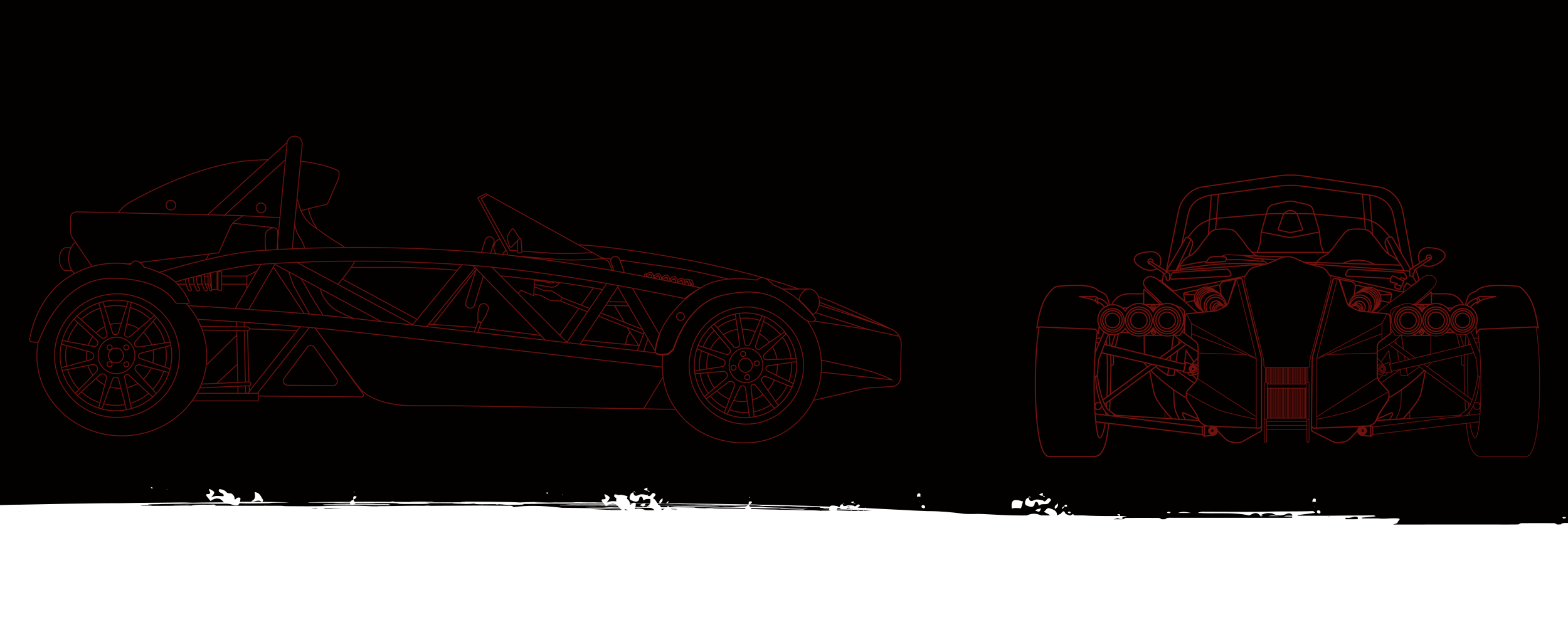
This is one of the few photos on this entire website where the background is not dropped. This is an outline drawing and spec sheet of the Ariel Atom 4 which was framed and given to owners while they waited for their cars to be built. The car was drawn on a WACOM Cintiq by hand in Adobe Illustrator.


