

RM Manifold
Full Re-Brand


RM Manifold
Re-Brand
I was approached by creative director Greg Croteau and the Nerd Herd team regarding being brought on as an AD for a re-brand for RM Manifold and their sub-brands.
The objectives of the project were:
• Establish RM Manifold as a parent brand with cohesive sub-brands that share a unified, technology-forward aesthetic while maintaining individual identities.
• Highlight RM Manifold’s innovative and credible leadership in the airflow control industry.
• Align the visual identity closer to a modern, technology-driven brand while preserving connections to its heritage.
Greg and the team had met with the key shareholders of RM Manifold before I was brought on and was able to tighten the focus on who they were and what they were moving the company to. Working from their discovered brand archetypes (Creator, Rebel, Jester) I went to the drawing board and flushed out numerous designs that we narrowed down to two, which I then presented to the RM team.
CD: Greg Croteau
AD: Luke Dobie
Agency: Nerd Herd

Through refinement, I honed in on a modern, bold, sans-serif font for the "RM" monogram, which became the central focus of the logo. I chose a color palette featuring blue to symbolize trust and reliability, paired with silver/gray for a touch of professionalism. I also created black and white versions of the logo to ensure flexibility across different applications.
After narrowing down the options, I presented the final design to the client. The resulting logo was clean, dynamic, and impactful, with the "RM" monogram at its core. It communicated RM Manifold’s core values and ensured versatility for both legal-facing and client-facing uses.
This project allowed me to fully take ownership of the creative direction and ensure that the final logo aligned with RM Manifold’s brand identity, delivering a visual solution that was both effective and memorable.
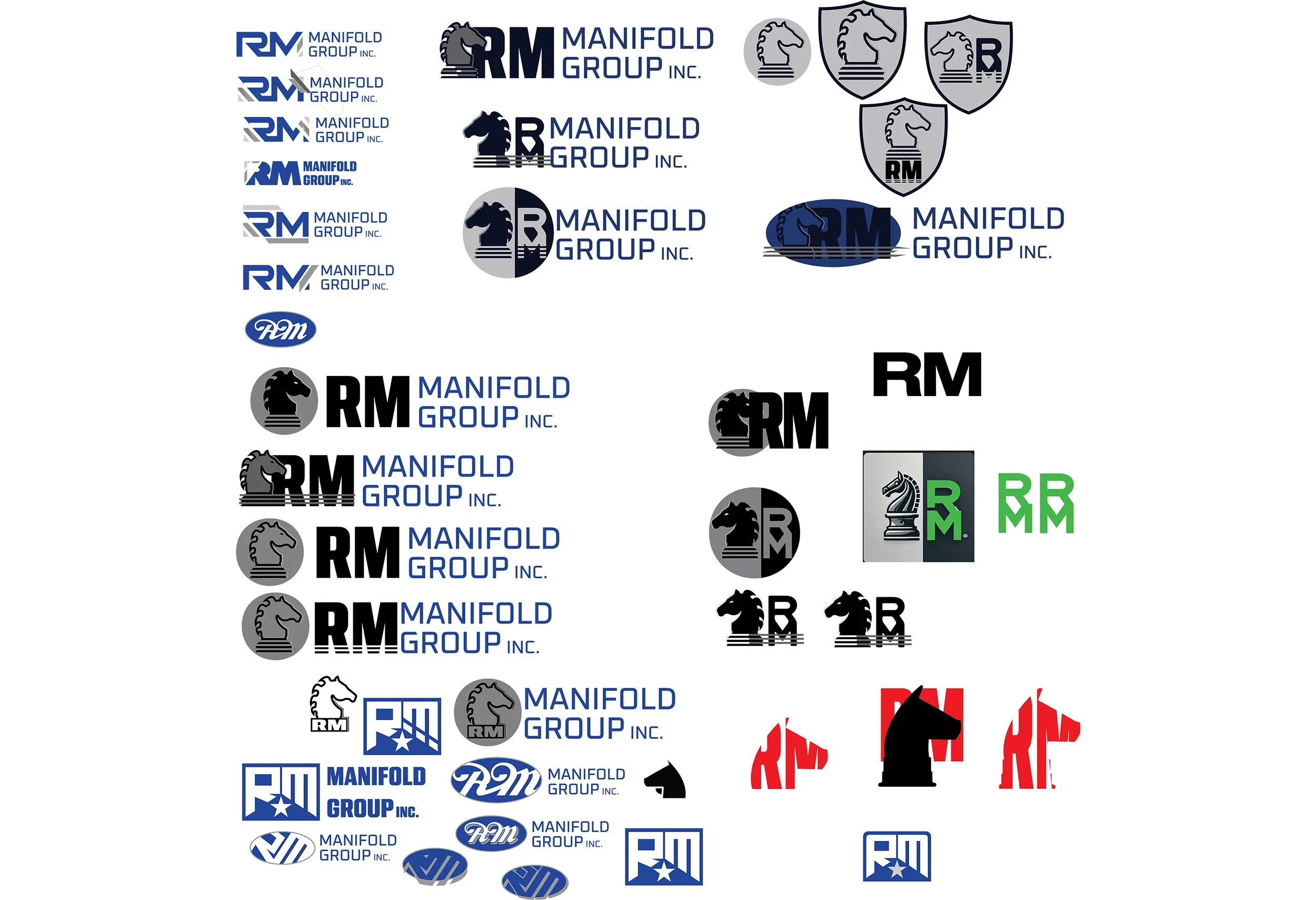
The Process
As the art director responsible for all the art on the RM Manifold logo project, I took full creative ownership from start to finish. While I worked closely with the creative director, I am typically client-facing and handle creative decisions the vast majority of the time. This allowed me to ensure that every design decision truly reflected RM Manifold’s identity and effectively told their brand story.
The design process began with broad exploration, where I experimented with different visual elements, including the "RM" monogram, geometric shapes, knight symbols, and abstract airflow lines. These early concepts helped me explore various combinations of typography, iconography, and color to best represent the brand. Though the knight symbol was initially considered, it ultimately didn’t make it to the final design. The focus shifted to a more streamlined and simplified logo.

RM Manifold Option One
A traditional, clean, strong, and modern logo fitting the HVAC market. “RM” balances simplicity and professionalism through its angular, bold, and direct design.
The “RM” icon is the most prominent element, with the “R” and “M” cleverly merged into a single cohesive design. The stylization of the “R” incorporates an angular, industrial style, while the “M” blends seamlessly without disrupting the flow.
The use of sharp, angular lines, and flat shapes suggests precision, and engineering, which resonates with RM’s core business.
The small, metallic-inspired, geometric elements inside the “M” resemble mechanical parts or vents, subtly hinting at the HVAC or industrial nature of the business. This minor detail adds depth to the icon, making it more dynamic without overpowering the simplicity of the design.

RM Manifold Option Two
A classic, bold, and timeless logo that embodies strength and reliability within the HVAC and airflow control industry. The "RM" icon features clean, structured letterforms that create a strong visual presence, balancing tradition with modern simplicity while avoiding overly technical detailing.
Rather than relying on literal HVAC iconography, the design emphasizes bold typography and structure to communicate durability and professionalism. Its classic composition ensures adaptability, making it effective across applications such as architectural drawings, product packaging, and apparel.
By focusing on a refined, authoritative look, this logo establishes RM Manifold Group as a brand that values heritage, craftsmanship, and strength, while remaining adaptable for the future.

Final RM Manifold Logo
The final RM Manifold logo that went into production included a few minor revisions from the initial version. One of the main changes was the color scheme. The dark grey abstract airflow line, which breaks up the last leg of the "M," was updated to red. This adjustment not only gave the logo a more Americana feel but also aligned it with the colors of their sub-brands, LF Systems and KW Draft, creating a unified brand aesthetic.
Additionally, there was a small modification to the company name. "RM Manifold Group Inc." was used exclusively for legal-facing documents, while the client-facing logo simplified the name to just "RM Manifold." This change streamlined the brand, ensuring a more professional and polished appearance for external communications.


RM Manifold & Sub-Brand Identity System
As the creative lead on RM Manifold’s branding, I developed a cohesive identity system that extends seamlessly across its sub-brands—US Draft, LF Systems, and KW Draft—ensuring brand recognition while allowing each sub-brand to maintain its own unique identity within the ecosystem.
Design Philosophy & Consistency
The design strategy follows a structured approach, ensuring that all sub-brands inherit the core DNA of RM Manifold while addressing their specific market positioning. This was achieved by maintaining consistent visual language, typography, color strategy, and structural elements across all logos.
Typography & Structure
The primary font used across RM Manifold and its sub-brands is clean, modern, and bold, reinforcing a sense of strength and reliability.
Each sub-brand integrates an iconic mark that embodies its specific industry while aligning with the overarching RM Manifold structure.
Color & Symbolism
Red, gray, and navy blue serve as unifying elements, ensuring instant brand recognition.
Each sub-brand mark utilizes angular cuts and bold geometric forms, a direct visual link back to the parent company’s identity.
The Signature Diagonal Element
A defining feature across all designs is the angled red and gray diagonal, an element borrowed from RM Manifold's logo. This serves as a subtle but powerful brand signature that visually ties each sub-brand to its parent company.


Sub-Brand Breakdown
US Draft
The shield design conveys protection, structure, and dependability, aligning with the brand’s purpose.
The "US" typography is custom-built, ensuring the letterforms maintain the strong, industrial feel of RM Manifold.
The red and gray diagonal mark remains a common branding thread across all sub-brands.
LF Systems
LF Systems’ identity takes a more architectural, technical approach.
The geometric grid-like structure reflects precision, engineering, and technical innovation, all core values of the brand.
The angular “LF” monogram follows the bold, structured letterform style set by RM Manifold.
KW Draft
Designed to reflect the kitchen and hearth industry, KW Draft integrates a home-like framing device around the letters.
The red framework symbolizes structure, reliability, and the concept of drafting in architectural design.
The open-frame concept ensures the logo is both distinctive and aligned with RM Manifold’s overall visual philosophy.
Conclusion
By applying consistent design principles across RM Manifold and its sub-brands, I ensured that each entity remains distinct yet interconnected. This design system strengthens brand equity, making RM Manifold’s sub-brands instantly recognizable while allowing them to serve their respective markets with clarity and impact.

RM Manifold Brand Guide:
A Unified Visual System
As the lead creative on RM Manifold’s brand development, I crafted a comprehensive brand guide to establish consistency, clarity, and scalability
across the company and its sub-brands. This guide serves as the foundation for visual and verbal communication, ensuring that RM Manifold
and its affiliated brands maintain a strong, unified identity across all platforms.
Building a Scalable Brand Identity
The RM Manifold brand guide was designed to provide clear, actionable guidelines for designers, marketers, and partners, ensuring seamless brand implementation across digital, print, and environmental applications.
Key components of the guide include:
Logo Usage & Variations
Standardized logo treatments for RM Manifold and its sub-brands (US Draft, LF Systems, KW Draft).
Guidance on clear space, scaling, and proper logo applications to ensure brand integrity.
Color System
A well-defined color palette featuring RM Manifold’s signature blue, red, and gray, designed for high contrast and strong visual impact.
Secondary and accent colors for expanded applications across marketing and digital media.
Typography Guidelines
A carefully curated typographic system that balances modern professionalism with technical precision.
Primary and secondary fonts selected to ensure legibility and brand cohesion across digital and print formats.
Graphic Elements & Iconography
A system of custom iconography and visual motifs that reinforce the brand’s identity.
Usage of angled cuts and geometric patterns inspired by the RM Manifold logo to create a cohesive look and feel.
Photography & Application Examples
Brand-approved photography guidelines to maintain a consistent tone and mood.
Real-world application mockups demonstrating the brand in stationery, web, advertising, and product branding.
Ensuring Brand Longevity & Recognition
This brand guide was not just designed as a static document but as a living resource that adapts with RM Manifold’s evolving needs. By creating a flexible yet structured system, the brand can scale efficiently across future marketing efforts, sub-brands, and product expansions.
Conclusion
The RM Manifold Brand Guide is a testament to strategic brand thinking and execution, ensuring that the company and its sub-brands maintain visual coherence and market impact. By establishing these guidelines, I’ve helped create a strong foundation for brand recognition, trust, and longevity in a competitive industry.